- Client:
- QT Hotels & Resorts
- Services:
- Brand Identity
- Art Creation
- Print Application
Context & ChallengeQT Perth teamed up with Toben to reimagine the visual identity of their award-winning in-house restaurant Santini. The well-known restaurant is made of two distinct spaces and experiences: a bold, authentic Italian restaurant, and a sleek ‘terrestrial-celestial’ and chrome inspired bar. The original brand was limited to a simple logo and colours, and didn’t quite live up to QT’s rich storytelling and playful unpredictability.
The challenge was a fun one: to craft an identity that captured both world – the Italian spirit as well as the intergalactic cool – both under the name of the ‘Saint’.
Context & ChallengeQT Perth teamed up with Toben to reimagine the visual identity of their award-winning in-house restaurant Santini. The well-known restaurant is made of two distinct spaces and experiences: a bold, authentic Italian restaurant, and a sleek ‘terrestrial-celestial’ and chrome inspired bar. The original brand was limited to a simple logo and colours, and didn’t quite live up to QT’s rich storytelling and playful unpredictability.
The challenge was a fun one: to craft an identity that captured both world – the Italian spirit as well as the intergalactic cool – both under the name of the ‘Saint’.
The Visual ConceptBuilding on the established Santini name, we pushed into unexpected territory—where the saint meets the futuristic and intergalactic. As a collision of ideas, we crafted abstracted saint-like figures, rendered as if communicating and transmitted from deep space — distorted, glitchy, and a little otherworldly. The visual is unexpected, maybe even a little provocative, inviting curiosity and deeper interpretation.
A Dual IdentityFor spatial brands, a strong identity needs to do serve a dual purpose — elevating the marketing while seamlessly enhancing the experience. Santini’s visual identity flexes between two distinct colour schemes that shine in each space. But at its core, the narrative and core graphic stay the same, allowing restaurant and bar to speak as one — whether in marketing or shared moments.
A Tactile ExperienceIn restaurants, the little tactile moments set the tone long before the first dish arrives. For a premium brand, every touchpoint should feel just as refined as the flavors on the plate. That’s why we focused on quality, innovation, and craftsmanship across all prints and bindings — think Buckram shells, bespoke binding, embossing, screen-printed cellophane overlays, foil accents and stocks, and metallic inks.


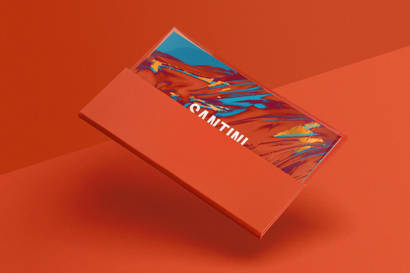
The Visual ConceptBuilding on the established Santini name, we pushed into unexpected territory—where the saint meets the futuristic and intergalactic. As a collision of ideas, we crafted abstracted saint-like figures, rendered as if communicating and transmitted from deep space — distorted, glitchy, and a little otherworldly. The visual is unexpected, maybe even a little provocative, inviting curiosity and deeper interpretation.


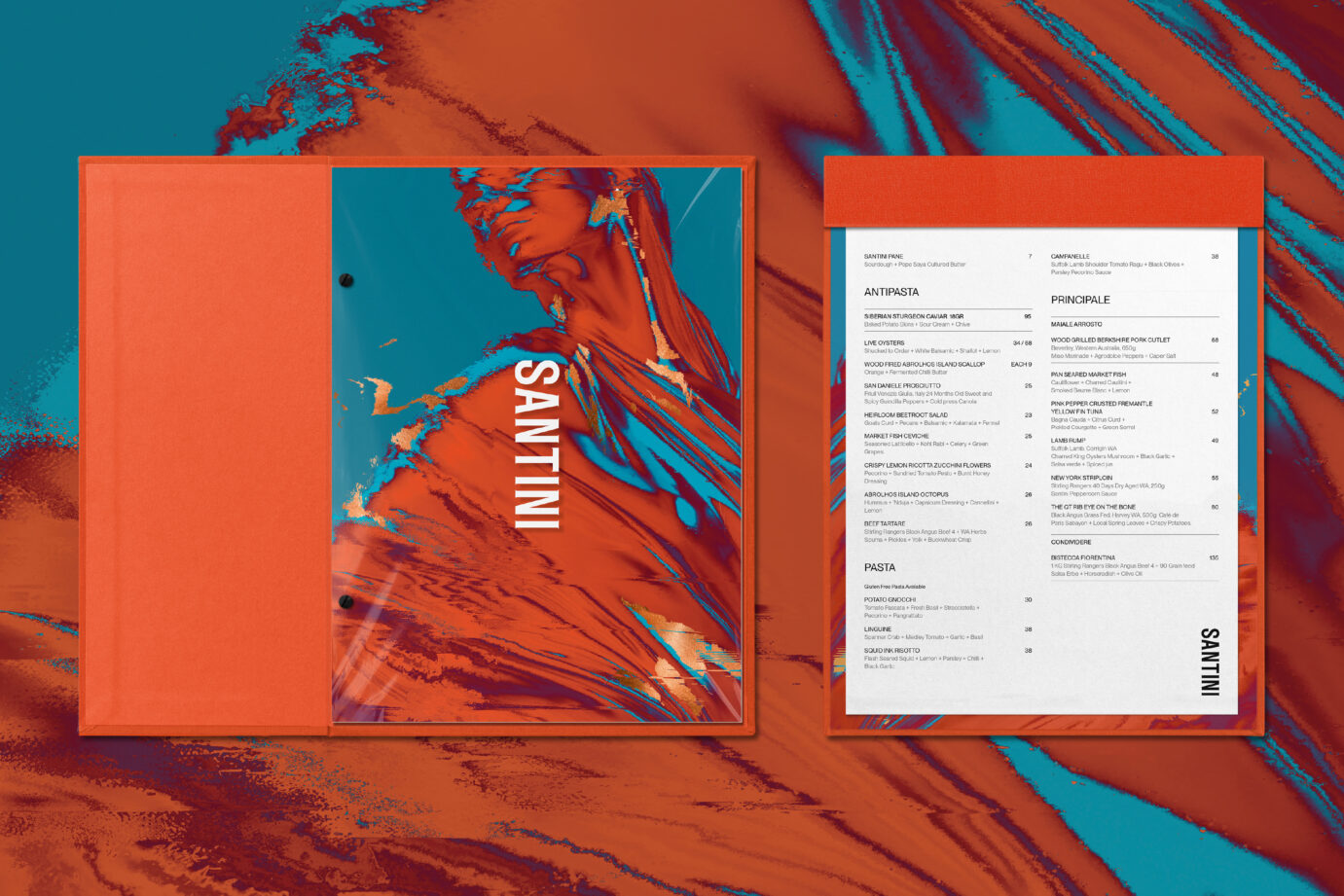
A Dual IdentityFor spatial brands, a strong identity needs to do serve a dual purpose — elevating the marketing while seamlessly enhancing the experience. Santini’s visual identity flexes between two distinct colour schemes that shine in each space. But at its core, the narrative and core graphic stay the same, allowing restaurant and bar to speak as one — whether in marketing or shared moments.

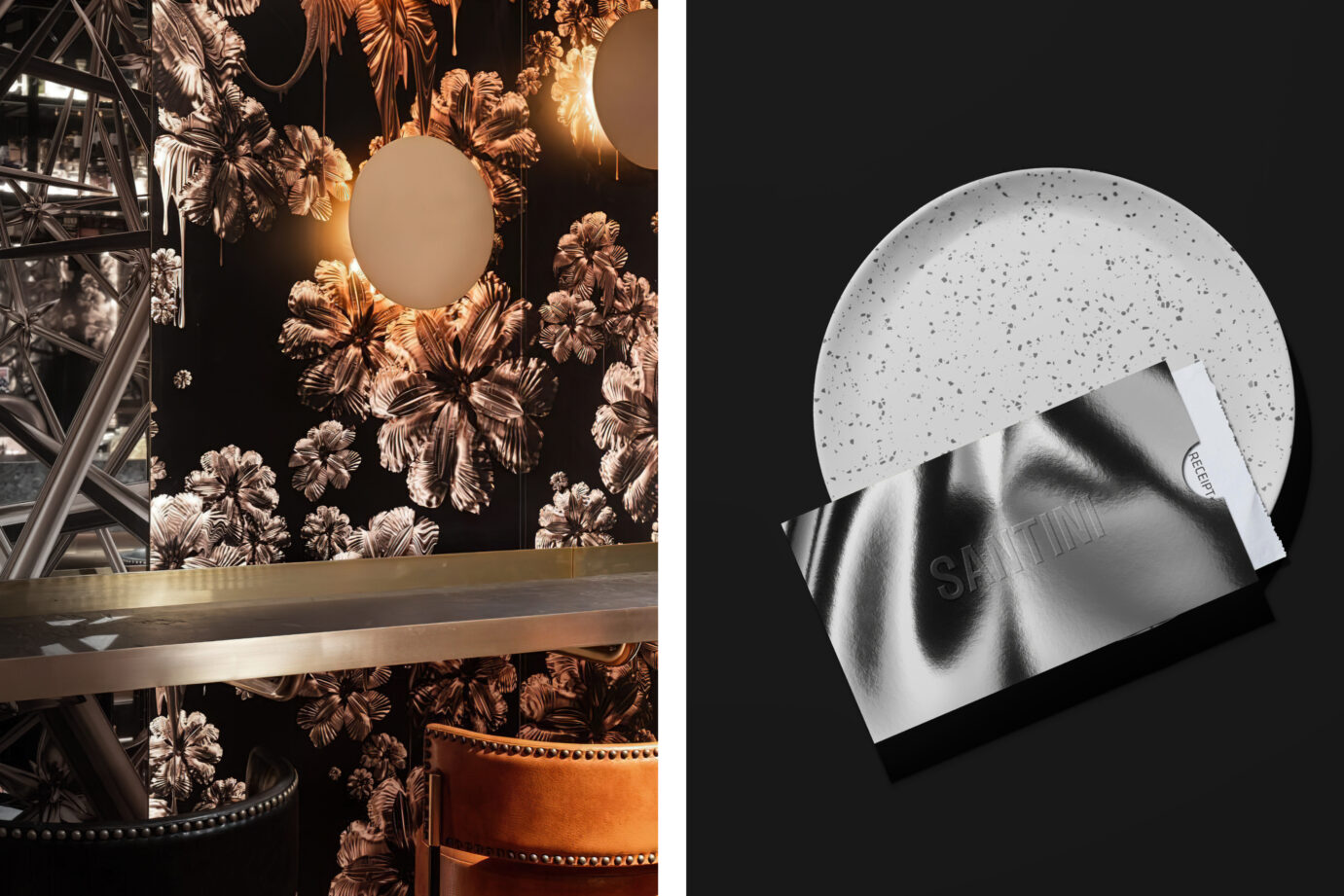


A Tactile ExperienceIn restaurants, the little tactile moments set the tone long before the first dish arrives. For a premium brand, every touchpoint should feel just as refined as the flavors on the plate. That’s why we focused on quality, innovation, and craftsmanship across all prints and bindings — think Buckram shells, bespoke binding, embossing, screen-printed cellophane overlays, foil accents and stocks, and metallic inks.


Collaborators
Interior Design — Nic Graham & Assoc. Location photography — QT Hotels and ResortsLogo (maintained): Fabio OngaratoPrint Production — Lisa McCulloch, Event
Awards
Graphis Awards — Gold
RELATED PROJECTS OR SEE ALL


WE’D LOVE TO HEAR FROM YOU! PLEASE